So this week we got to do a play test for the first time in several months. Play tests are probably one of the few morale boosts this team has, one of the big advantages of making a multiplayer game. I also noted that my productivity went up like crazy the day before the test because I wanted to fix up various things before hand. It’s always hard to artificially make dead lines for yourself that feel real, but scheduled weekly tests are surprisingly effective at it. The core focus of this test was to see how the new zone movement felt in action. I was a little worried about doing it before the new quest systems were added since the old system is pretty incongruent with the new zone movement. Nonetheless I think we got some important feedback on the movement itself.
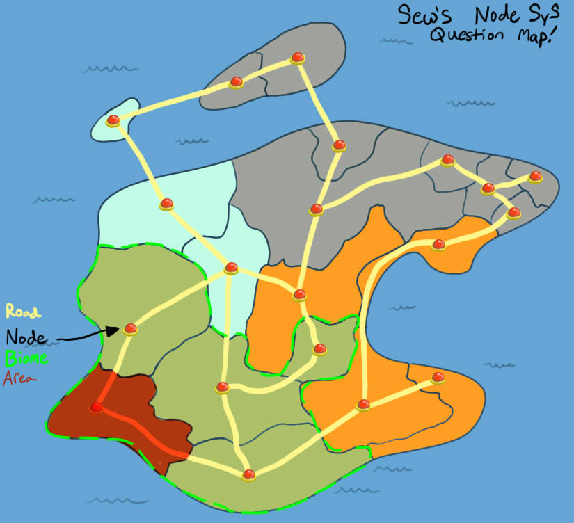
Sew was confused about zone movement throughout the test (actually, pretty much everyone was, including myself). So much so that he actually created metaphor of country borders for zones so that he could understand them more easily (which is actually a pretty great way to explain concept):
And really, who wouldn’t be just look at this mess:

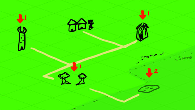
For awhile we assumed that it was largely an art issue- a big ol’ jumble of objects not intended for this purpose. Sew had even mocked up an example of a better way to display them:

But Sew found that even with a simple mock up of color coded zones the layouts were still a jumbled mess to interpret. Even besides being messy he also had a feeling of exploration not being as satisfying as it was in the old system (even though the discovery system of not revealing a zone’s connections should have improved it over all). The only thing he could point to on the feeling was that maybe the zone walls made it feel claustrophobic. I suspected that the readability was actually the problem- it’s hardly satisfying to grope around a space that you don’t really understand the physicality of. He then suggested perhaps moving to a node/road system:
Back during the zone planning I had considered switching to such a system. In fact, the zone system was even going to be retrofit to adopt it. But that turned out to be unfeasible due to the nature of 4 directional roads contradicting zones supporting many more connections than just 4. The zone system would either have to be awkwardly forced to stick to certain connection limits, or (for better results) scrapped entirely with a new style of generator. So I went with the existing zone system, figuring that adjacent blobs would be more readable than having to trace complicated roadways anyway.
I told Sew that I thought such a system still had readability problems from the complicated roads with multiple crossroads with a cost of 1. He then inquired about how I felt about board game style movement, which the node/road system is very similar to. My thought that such games might look complicated to read, but are actually very simple to navigate since there’s only a hand full of points where the player make an actual movement choice, and most of the time they’re forced down a specific route. It was at that point when I realized where the actual problem was at: most board games either use very limited choose-a-branch movement or a direct grid. And the reason for that is readability: in either case players can take a quick look at the map and infer the distance between points without ever having to trace pathways- with a pure grid it’s as simple as the distance between points.
So it has become clear that I’ve been trying too hard with the idea of naturalistic map generation (that largely looks the same in execution anyway- a big mess). The solution I’ve come up to address the problem is to effectively snap zones to a grid of squares. So while in essence the game map is just a tile based grid (with zones acting as very big “jumbo” tiles), the tiles within the zone allow for some internal variety to create an illusion that it isn’t as much of a grid as it looks. Here’s an example of a map operating off of a 3×3 grid:

The graveyard is at the center of the grid, even though it may not look like it is since it’s placed at a far right offset within its zone. With this set up we hopefully combine the readability of a grid with the visual allure of a landscape. Sew’s happy that it doesn’t rely on walls or biome tiles. I’m happy that it’s the simplest thing to convert the existing generator into. We’ll find out whether it actually works next week!